Configuration Form
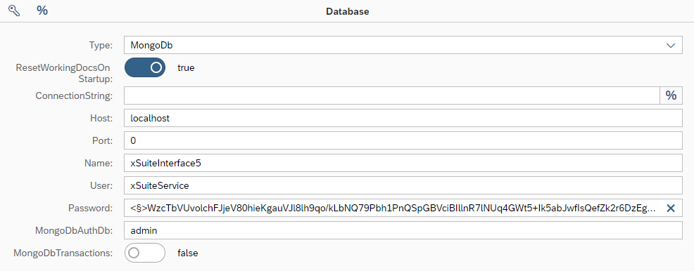 |
If you have selected an object in the configuration tree, the elementary configuration properties of the object will be displayed in the configuration form. You can edit the individual values of the configuration properties in this form.
Mandatory configuration properties are indicated with a red asterisk ( ) after the field title. If the specification is only mandatory in a specific context (e.g., depending on another property), the asterisk will be dark red (
 ).
).
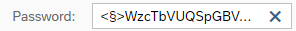
Properties that represent a password or allow the inclusion of a password via the § button are identified by a § character in the placeholder text of the input field. Properties whose values can be generated dynamically at runtime from field variables and system variables are identified by a % sign.
Fields
Depending on the type of configuration property, different types of input fields will be available in the configuration form:
Field | Field value | Description | ||
|---|---|---|---|---|
| Text value | A text input field is displayed for text values. | ||
| Password | In a field for entering a password or password hash, the input value is automatically encrypted, or its hash value is calculated. Prerequisite for encryption is the specification of a corresponding certificate of the type "Crypt" in the global configuration of the running program instance. | ||
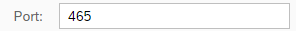
| Numeric value | A text input field is displayed for numerical values. Only numerical characters can be entered. | ||
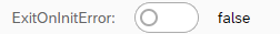
| Boolean value | An on/off switch is displayed for Boolean values, supplemented by a plaintext display of their value ( This display also serves as an input field if the value is to be defined with a constant. | ||
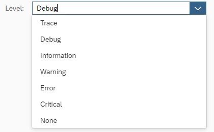
| Pick list | All available values of a configuration property are displayed in selection lists. You can select one of these values. Alternatively, you can enter a constant directly in the field. | ||
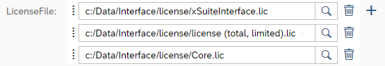
| Multiple values | For properties with multiple values, all relevant input fields are listed. Use the The values can be moved within the list by drag-and-drop. Use the |


Buttons
Button | Description | ||
|---|---|---|---|
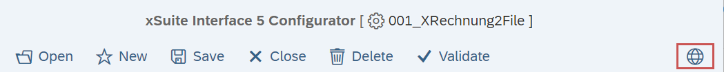
| Specifies a global configuration. It will only appear in the menu bar if a scenario configuration is open in the Configurator.
When you click this button, you can choose which global configuration to use for additional data in the editing of the current scenario configuration. Such additional data might serve the purposes of selecting global constants, global web service users, or other such globally defined elements. Always select the specific global configuration that is used for executing the scenario at runtime. | ||
| Inserts an encrypted password value at the position in the input field, or overwrites the selected text. This function can be used for fields in which a password only represents a partial value (e.g., in a connection string). Those fields that are just for passwords are automatically decrypted directly after plaintext has been entered. Decryption at runtime only applies to those configuration properties identified for this in this documentation and in the Configurator. This button is available in the title bar of every input form. | ||
§ | Inserts a constant or a field/system variable at the position in the input field, or overwrites the selected text. The constant is what has been defined either in the current configuration or in the global configuration that was selected ( This button is located directly alongside some input fields, in which case, it can be used to select special variables that are only relevant for the respective configuration property. This button is available in the title bar of every input form. | ||
| Opens a value help. Additional value help is available for some configuration properties (e.g., ones requiring special input syntax or the selection of an entry from a selection list). | ||
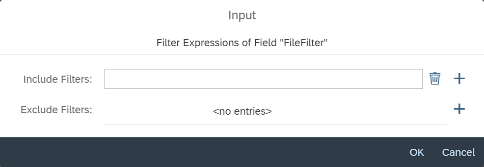
| Opens filter options.
Positive and/or negative filters can be defined in the filter options. To add a new entry, click on the A filter entry can consist of a wildcard expression (with | ||
| Opens the macro editor. With the macro editor, you can select and test existing macro expressions. For more information on how to use the macro editor, see Macro editor for internal macro functions. | ||
| Opens a value help dialog for selecting composite values. The dialog offers options for field values that are made up of several sub-parameters (see Composite Value Syntax) and is structured generically, based on metadata. Each input field represents one of these parameters and is labelled with its name. One of two syntax variants can be used for composite values; one transfers the parameter names and values, and the other transfers only the parameter values in the specified order. Use the Use names button to toggle between the two options. | ||
| Represents the data of the form content in JSON format. Edit content directly in this JSON. After a syntax check, accept the edited content by clicking on the NoticeThis button is only available in expert mode. CautionProcessing JSON data is a special function that should only be used in justified exceptional cases. Use of this function can have unexpected consequences. When handling JSON data, take particular care not to edit or delete no sub-elements that form their own sub-nodes in the configuration tree. When data has been changed, only the display of the form will be updated, not the display of the tree. This can lead to inconsistencies between the displayed configuration data and the actual configuration data, which in turn might lead to subsequent errors in downstream processing. |